# Plot scatter plot with x = pressure, y = wind
plot(storms$pressure, storms$wind, col = "blue",
     main = "Scatterplot of Wind vs Pressure")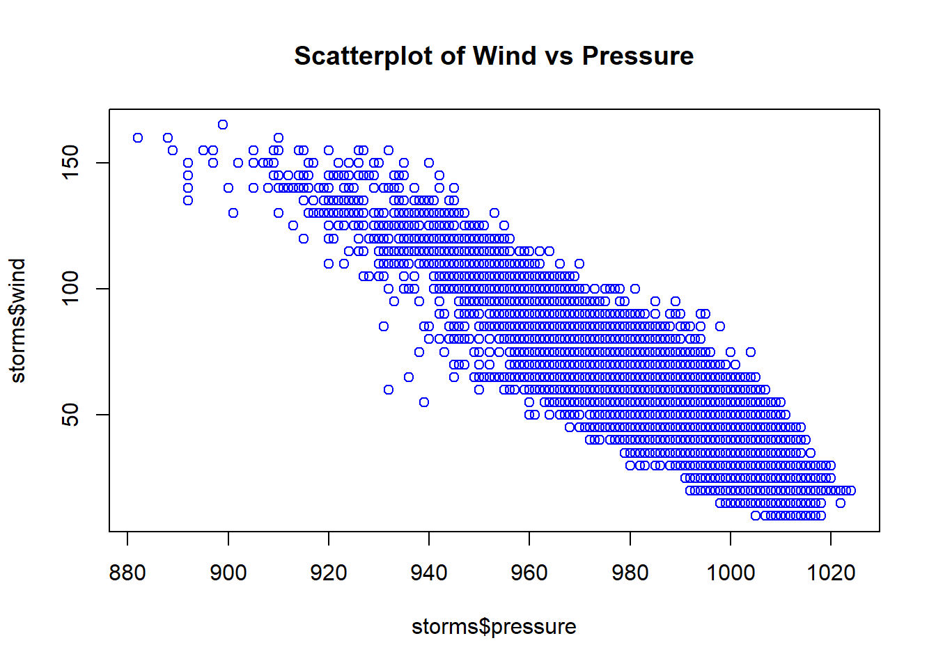
R is nowadays equipped with two independent (incompatible, yet coexisting) systems for graphics generation:
Visualization using ggplot2 will be introduced and compared with Base R Graphics.
Example: Draw scatterplot of wind vs pressure of the data set storms (in the tidyverse package).
# Plot scatter plot with x = pressure, y = wind
plot(storms$pressure, storms$wind, col = "blue",
main = "Scatterplot of Wind vs Pressure")
Example: Draw scatterplot matrix of first 4 variables of the data frame iris (in the datasets package).
#>   Sepal.Length Sepal.Width Petal.Length Petal.Width Species
#> 1          5.1         3.5          1.4         0.2  setosa
#> 2          4.9         3.0          1.4         0.2  setosa
#> 3          4.7         3.2          1.3         0.2  setosa
#> 4          4.6         3.1          1.5         0.2  setosa
#> 5          5.0         3.6          1.4         0.2  setosa
#> 6          5.4         3.9          1.7         0.4  setosa
# pch = 19 stands for points symbols type 19,
# which is solid circle
pairs(iris[,1:4], pch=19)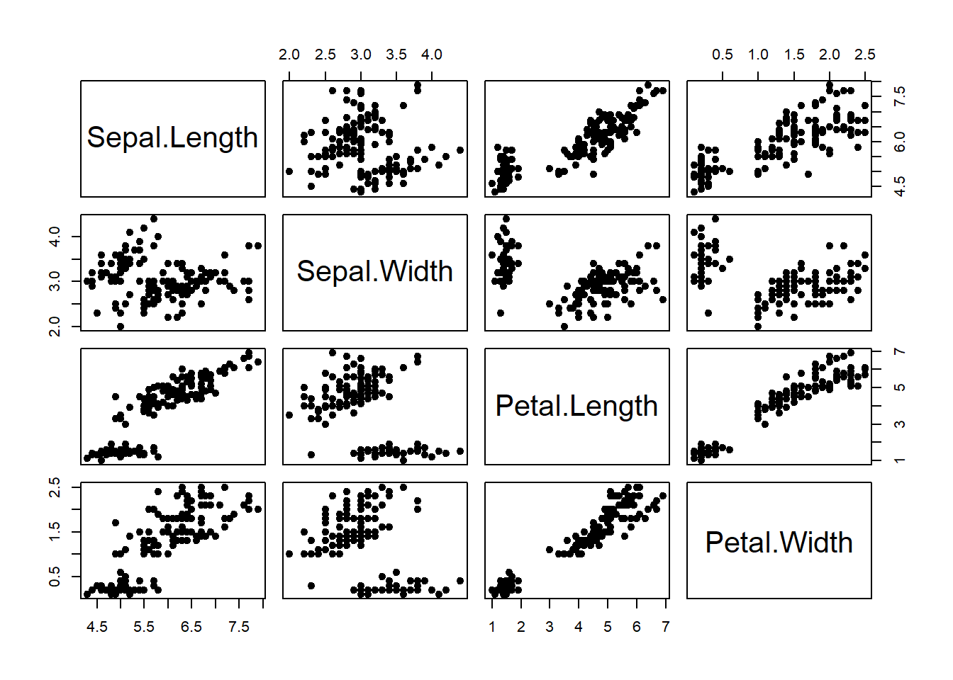
#>   Month_Since_2004 DataScience MachineLearning
#> 1                1          12              16
#> 2                2          10              14
#> 3                3           7              12
#> 4                4           7              16
#> 5                5           5              14
#> 6 6 7 11par(mfrow=c(1,2)) # 1 row, 2 columns (row-wise filling)
plot(ds$Month_Since_2004, ds$DataScience, type="l",
main = "Line Plot for Data Science",
xlab = "Number of Months Since 2004",
ylab = "Data Science Search Counts") # type="l" represents lines
### Plot with points and line
plot(ds$Month_Since_2004, ds$DataScience, type="b", # type="b" represents both
main = "Line and Point Plot for Data Science",
xlab = "Number of Months Since 2004",
ylab = "Data Science Search Counts") 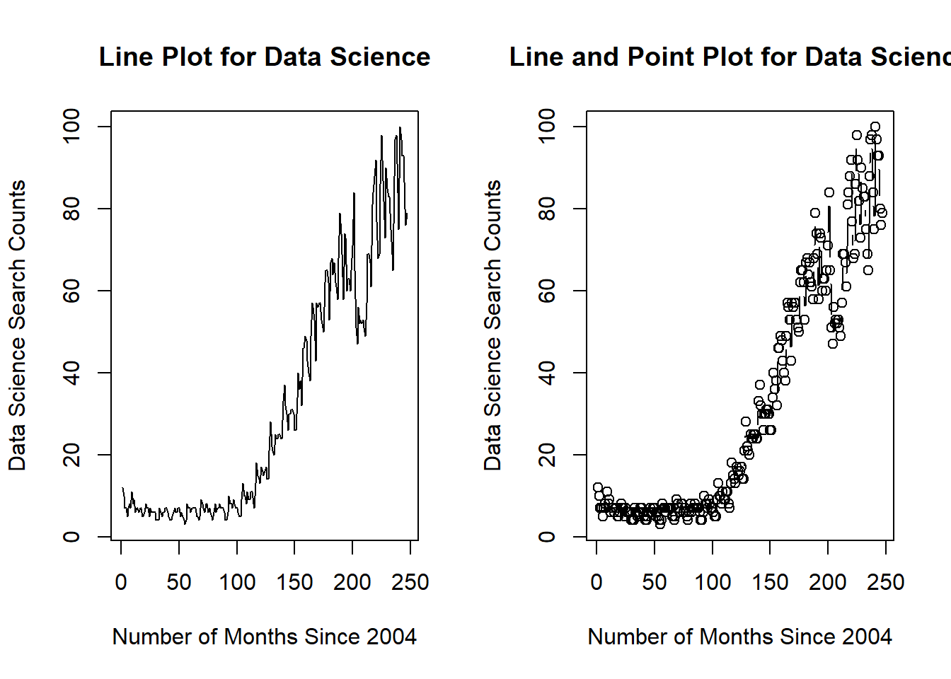
par(mfrow=c(1,1)) # reset to defaultExample: We could place multiple linegraphs on one plot. Draw two linegraphs (DataScience vs Month_Since_2004, MachineLearning vs Month_Since_2004) on a single plot.
plot(ds$Month_Since_2004, ds$DataScience, type="l", col="red")
lines(ds$Month_Since_2004, ds$MachineLearning, col="blue")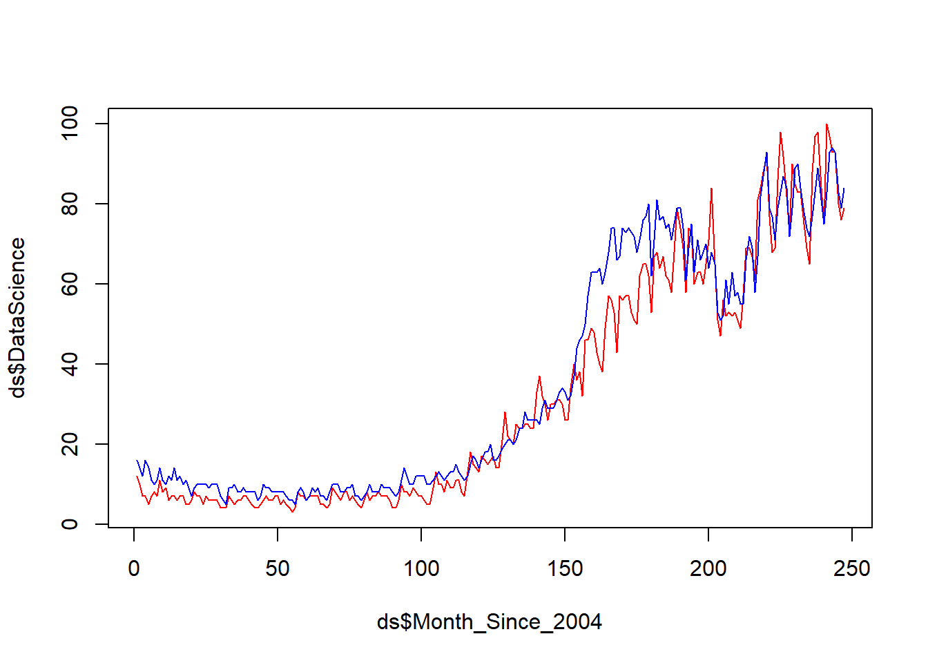
Example: Draw histogram of variable Sepal.Width in the data frame iris (in the datasets package).
data(iris)
hist(iris$Sepal.Width)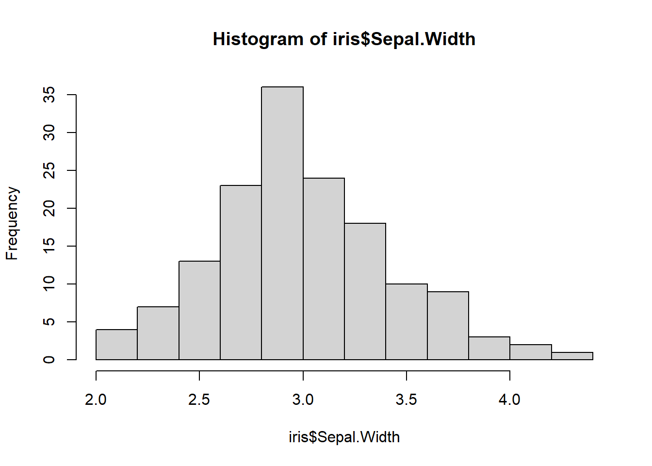
library(Hmisc)
hist.data.frame(iris[,1:4])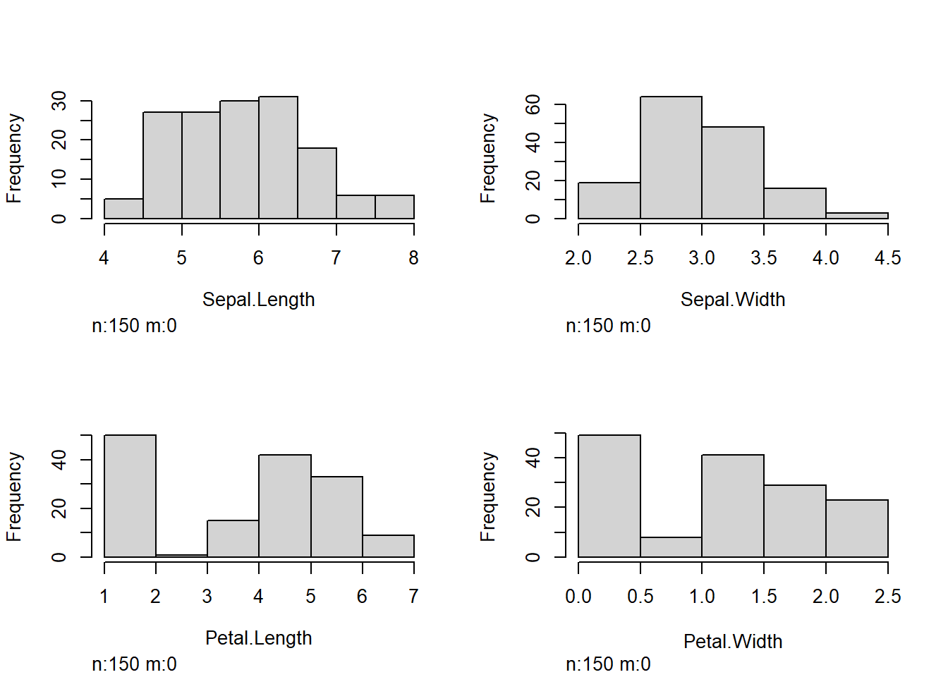
Example:
Draw a boxplot of the variable wind in the data frame storms (in the tidyverse package).
Draw a boxplot of wind vs category of the data frame storms.
par(mfrow=c(2,2)) # Arrange the plots in 2*2 graphical matrix

### (a) boxplot of wind
boxplot(storms$wind, main = "(a) Vertical")
boxplot(storms$wind, horizontal = TRUE, main = "(a) Horizontal")
### (b) boxplot of wind over levels of category
### vertical boxplot by default
boxplot(wind ~ category, data = storms, main = "(b) Vertical")

### horizontal boxplot
boxplot(wind ~ category, data = storms, horizontal = TRUE, main = "(b) Horizontal")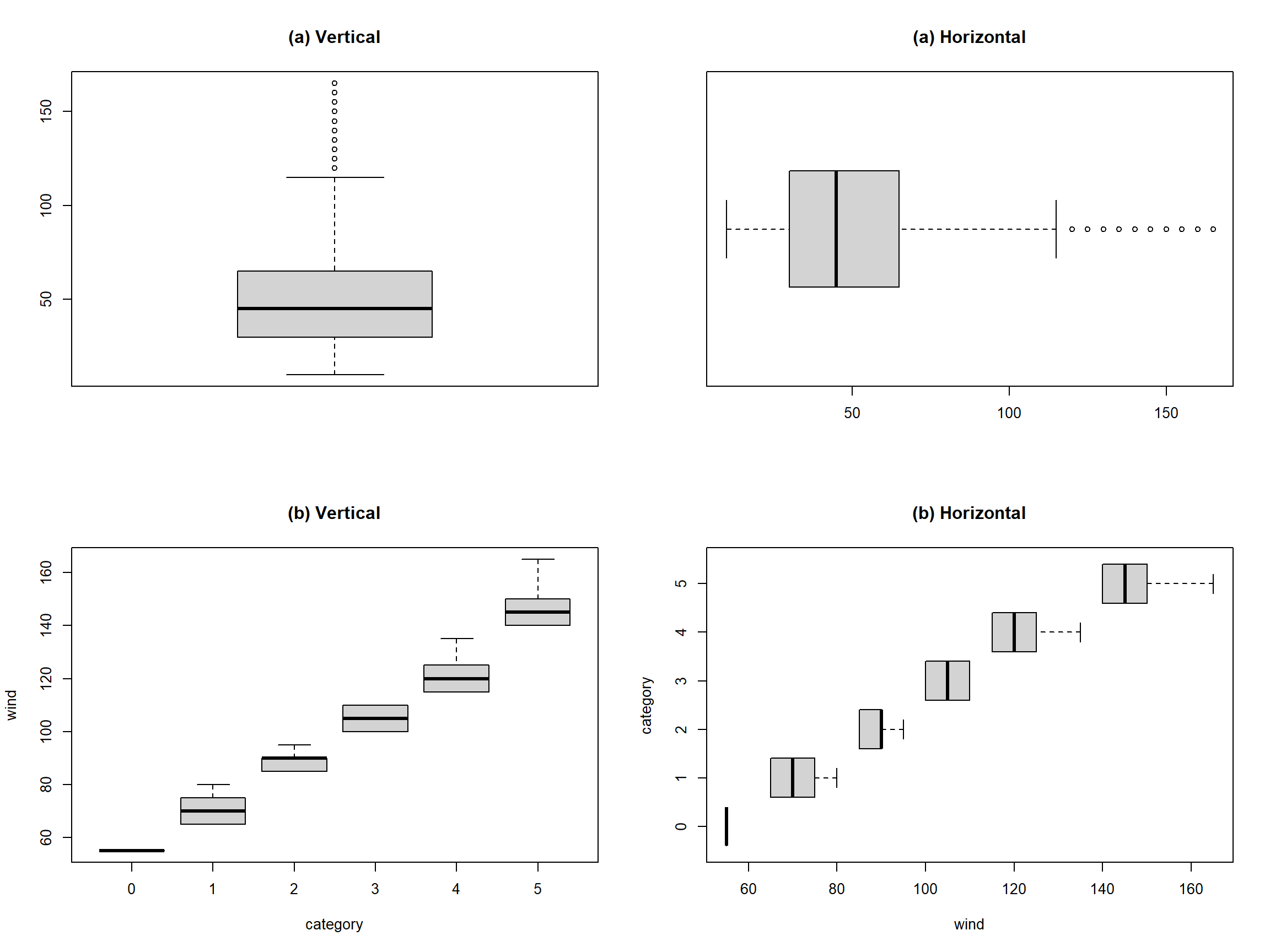
par(mfrow=c(1,1))Example: In the storms dataset,
Draw a barplot of variable status.
Draw a barplot of variable of status and category.
### (a) Barplot
counts = table(storms$status)
barplot(counts)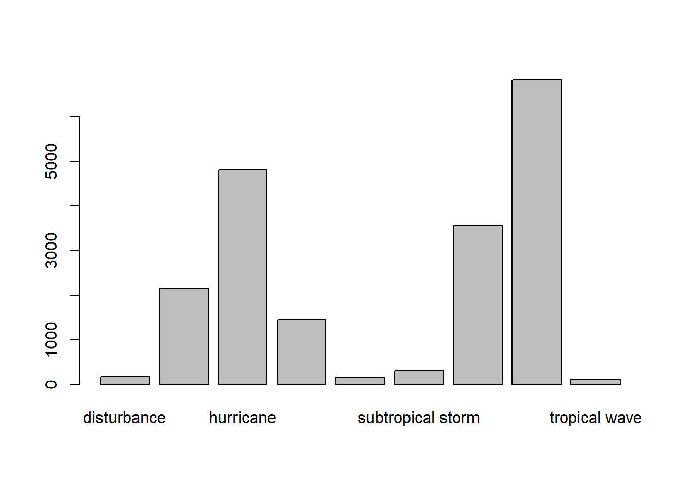
counts
#>
#>            disturbance          extratropical              hurricane
#>                    171                   2151                   4803
#>              other low subtropical depression      subtropical storm
#>                   1453                    151                    298
#>    tropical depression         tropical storm          tropical wave
#>                   3569                   6830                    111

# Horizontal barplot
barplot(counts, horiz=TRUE)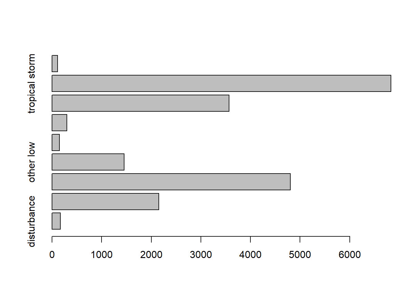
### (b) Barplot of two variables
counts = table(storms$category, storms$status)
counts
#>
#>     disturbance extratropical hurricane other low subtropical depression
#>   0           0             0         0         0                      0
#>   1           0             0      2548         0                      0
#>   2           0             0       993         0                      0
#>   3           0             0       593         0                      0
#>   4           0             0       553         0                      0
#>   5           0             0       116         0                      0
#>
#>     subtropical storm tropical depression tropical storm tropical wave
#>   0                 0                   0              1             0
#>   1                 0                   0              0             0
#>   2                 0                   0              0             0
#>   3                 0                   0              0             0
#>   4                 0                   0              0             0
#>   5                 0                   0              0             0

barplot(counts, col= c("steelblue", "firebrick", "lightblue", "mistyrose", "lightcyan",
  "lavender", "cornsilk"), besid=TRUE, legend = rownames(counts),
  args.legend=list(title="Category"))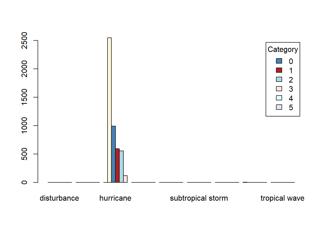
category variable in storms represents the Saffir-Simpson storm category (range from 1 to 5), which the scale based only on a hurricane’s maximum sustained wind speed.library(ggplot2) is used by fivethirtyeight, Financial Times, BBC, the Urban Institute, and more.library(ggplot2) is like playing a set of building blocks (it’s fun!)Assume we have the variables xvar, yvar in the data frame df.
### scatterplot
ggplot(data=df, mapping=aes(x=xvar, y=yvar)) +
  geom_point()

### linegraph
ggplot(data=df, mapping=aes(x=xvar, y=yvar)) +
  geom_line()

  #linegraph with dots
  ggplot(data=df, mapping=aes(x=xvar, y=yvar)) +
    geom_line() +
    geom_point()

### histogram
ggplot(data=df, mapping=aes(x=xvar)) +
  geom_histogram()

### boxplot
  # boxplot of one variable yvar
  ggplot(data=df, mapping=aes(y=yvar)) +
    geom_boxplot()
  # boxplot of the yvar vs xvar
  ggplot(data=df, mapping=aes(x=xvar, y=yvar)) +
    geom_boxplot()

### barplot of variable x
  # If not pre-counted, use geom_bar()
  ggplot(data=df, mapping=aes(x=xvar))+
   geom_bar()
  # If precounted, use geom_col()
  ggplot(data=df_counted, mapping=aes(x=xvar,y=counts))+
geom_col()Function: geom_point(x,y)
Example: Draw scatterplot of wind vs pressure of the data set storms (in the tidyverse package).
# Data preparation
library(tidyverse)
data(storms) # data frame in tidyverse package

storms[6923, "category"]=0 #Fixed one error value
storms$category = as.factor(storms$category)
# load the data set storms (in the tidyverse package)
ggplot(data = storms, mapping = aes(x=pressure, y=wind))+
geom_point()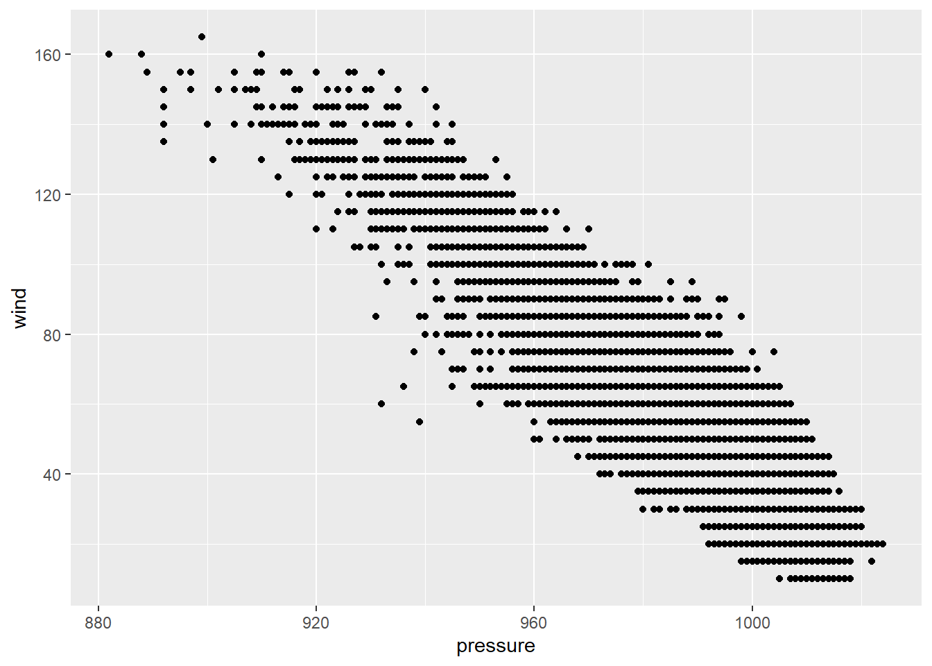
 # Changing the transparency
ggplot(storms, mapping = aes(x=pressure, y=wind)) +
  geom_jitter(alpha=0.2)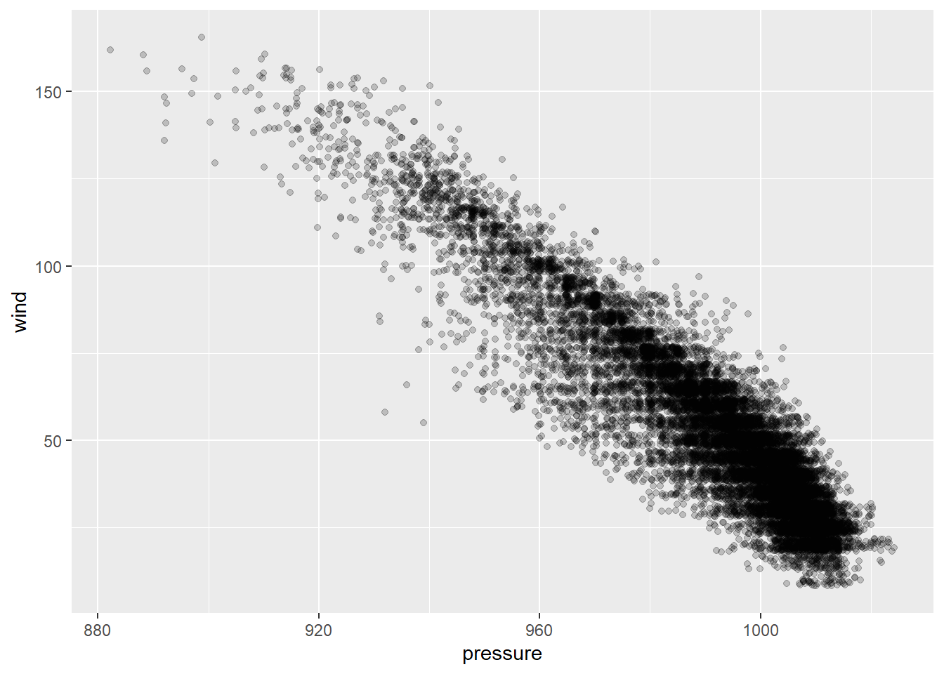
Function: ggpairs(df)
Example: Draw scatterplot matrix of first 4 variables of the data frame iris (in the datasets package).
data(iris)

library(GGally)
ggpairs(iris[,1:4])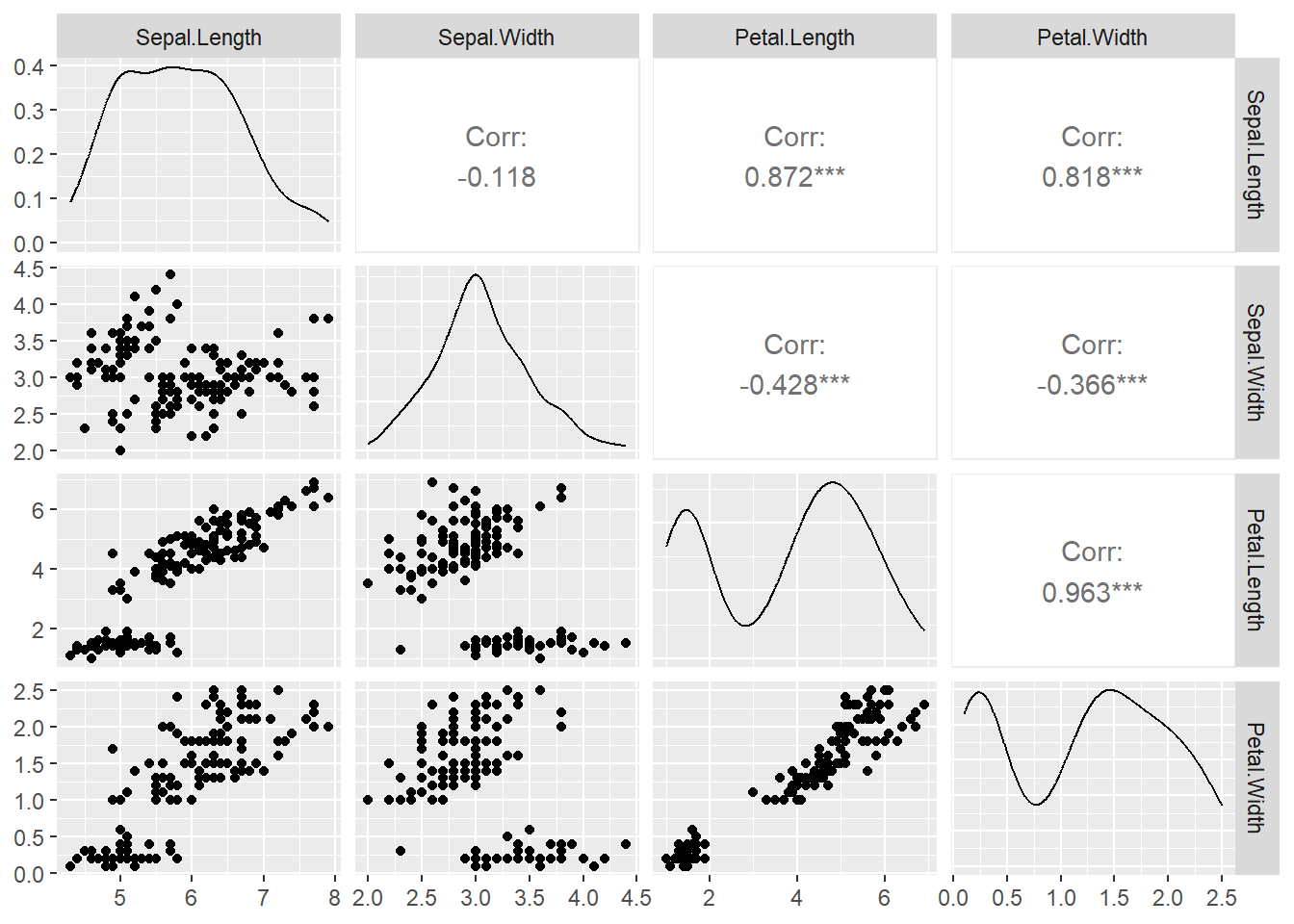
Function: geom_line()
Example: From https://trends.google.com/, we downloaded the time series data set GoogleTrendDataScience.csv with three variables Month_Since_2004, DataScience, MachineLearning.
Draw a linegraph of the Data Science search counts vs Month.
Draw a linegraph with points.
ds = read.csv("GoogleTrendDataScience.csv")

### Plot with line only
p1 = ggplot(ds, aes(x = Month_Since_2004, y = DataScience)) +
  geom_line()

### Plot with points and line
p2= ggplot(ds, aes(x = Month_Since_2004, y = DataScience)) +
  geom_line() +
  geom_point(size=1.5)

library(gridExtra)
grid.arrange(p1, p2, nrow = 1, ncol = 2)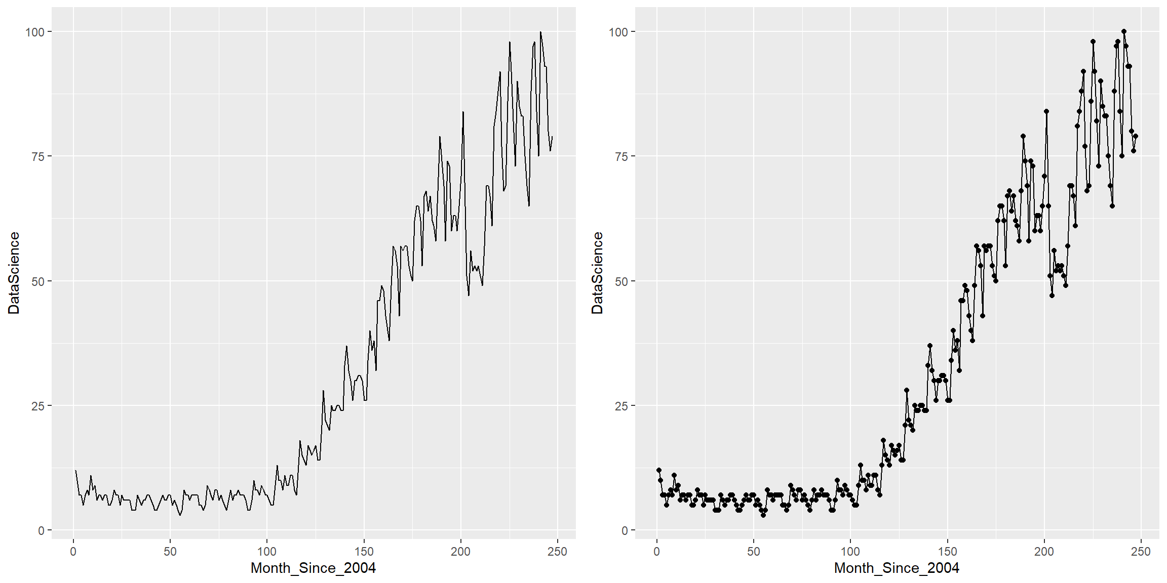
Function: geom_line()
Example: We could place multiple linegraphs on one plot. Draw two linegraphs (DataScience vs Month_Since_2004, MachineLearning vs Month_Since_2004) on one plot.
ggplot(ds) +
  geom_line(aes(x=Month_Since_2004, y=DataScience), col = "tomato3", size = 1.5) +
  geom_line(aes(x=Month_Since_2004, y=MachineLearning), col="steelblue", size = 1.5)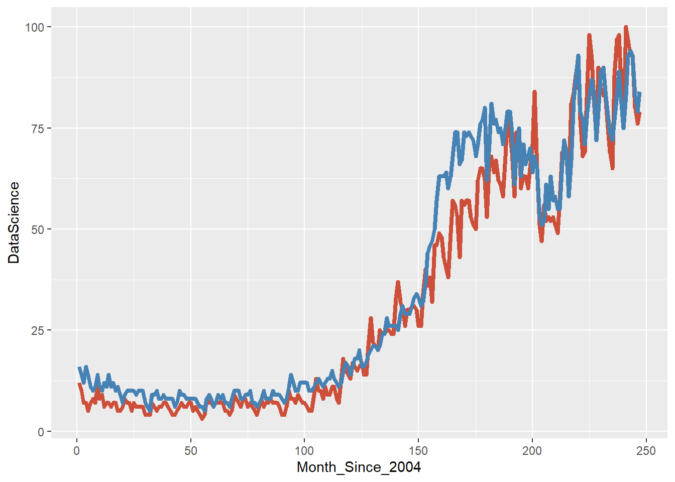
Function: geom_histogram()
Example: Draw histogram of variable Sepal.Width in the data frame iris (in the datasets package).
## Illini orange and blue!
ggplot(iris, aes(x=Sepal.Width)) +
  geom_histogram(binwidth=0.2, color="#13294B", fill="#FF5F05")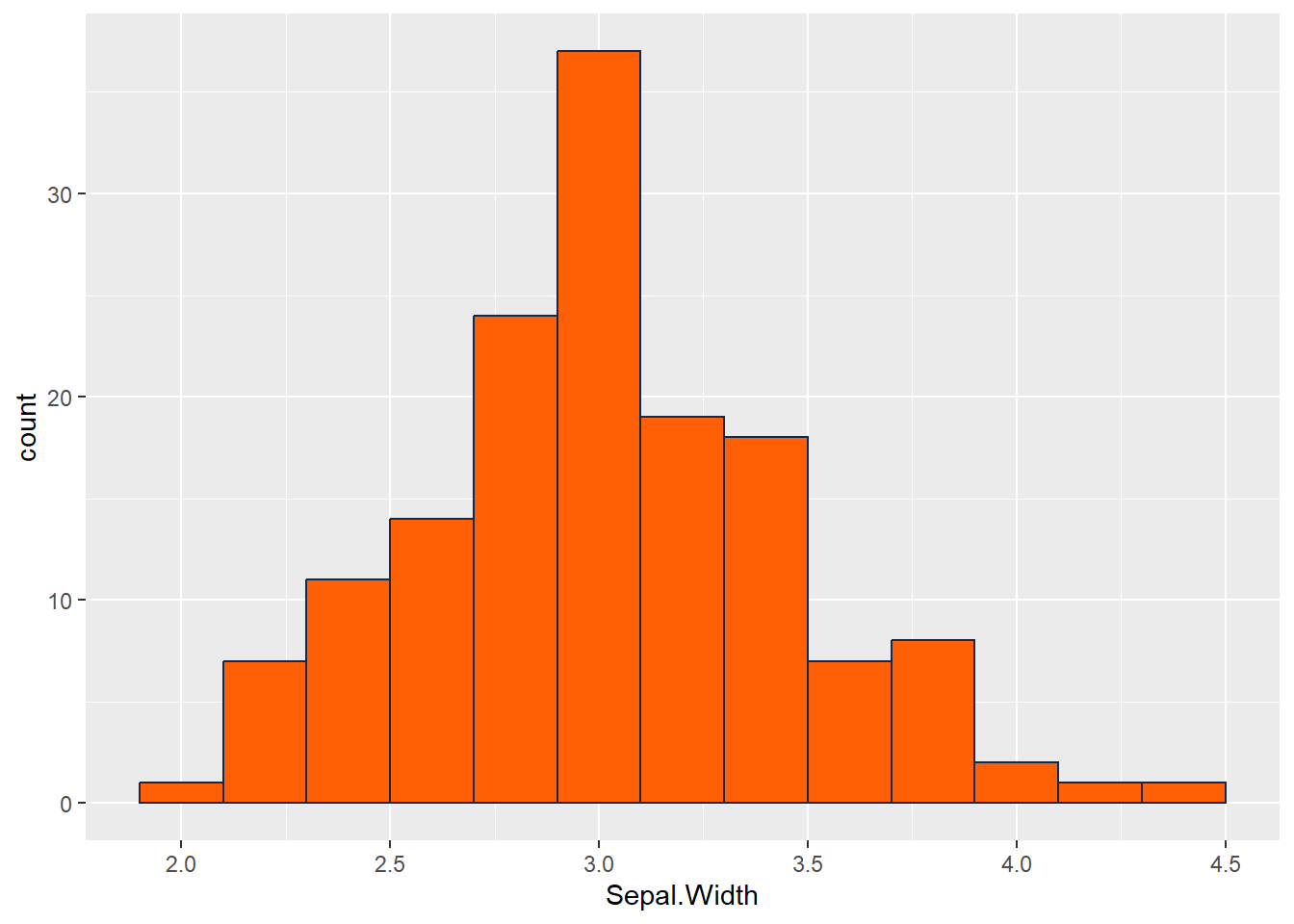
Functions: geom_boxplot()
Example:
Draw a boxplot of the variable wind in the data frame storms (in the tidyverse package).
Draw a boxplot of wind vs category of the data frame storms .
### (a) boxplot of wind
p1 = ggplot(storms, aes(y=wind))+
  geom_boxplot()


### (b) boxplot of wind over levels of category
### vertical boxplot by default
p2 = ggplot(storms, aes(x = category, y = wind))+
  geom_boxplot()

### horizontal boxplot
p3 = ggplot(storms, aes(y = category, x = wind))+
  geom_boxplot()
# Or
p4 = ggplot(storms, aes(x = category, y = wind))+
  geom_boxplot()+
  coord_flip()

grid.arrange(p1, p2, p3, p4, nrow = 2, ncol = 2)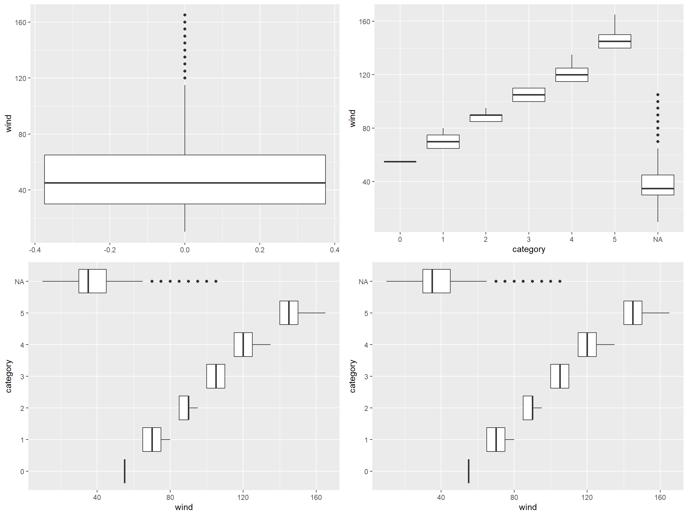
Functions: geom_bar(), geom_col()
Example: In the storms dataset,
Draw a barplot of variable status.
Draw a barplot of variable of status and category
### Barplot
    # If not pre-counted, use geom_bar()
    ggplot(storms, aes(x = status))+
      geom_bar()+
      scale_x_discrete(guide = guide_axis(angle = 45)) ### Rotate the x axis label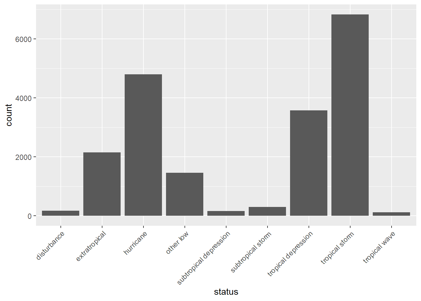
    # If precounted, use geom_col()
    storms %>%
      group_by(status) %>%
      summarise(count = n())%>%
      ggplot(aes(x = status, y = count)) +
      geom_col()+
      scale_x_discrete(guide = guide_axis(angle = 45)) ### Rotate the x axis label
# Horizontal barplot
ggplot(storms, aes(y=status))+
  geom_bar()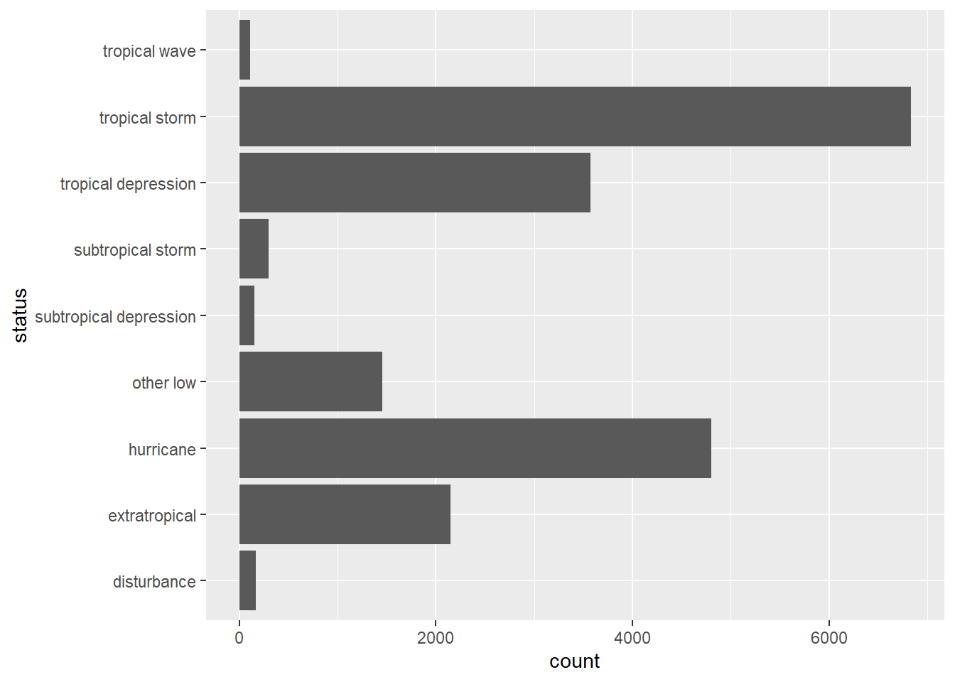
### Barplot of two variables
ggplot(storms, aes(x = status, fill = factor(category)))+
  geom_bar(position = "dodge")+
  scale_x_discrete(guide = guide_axis(angle = 45)) ### Rotate the x axis label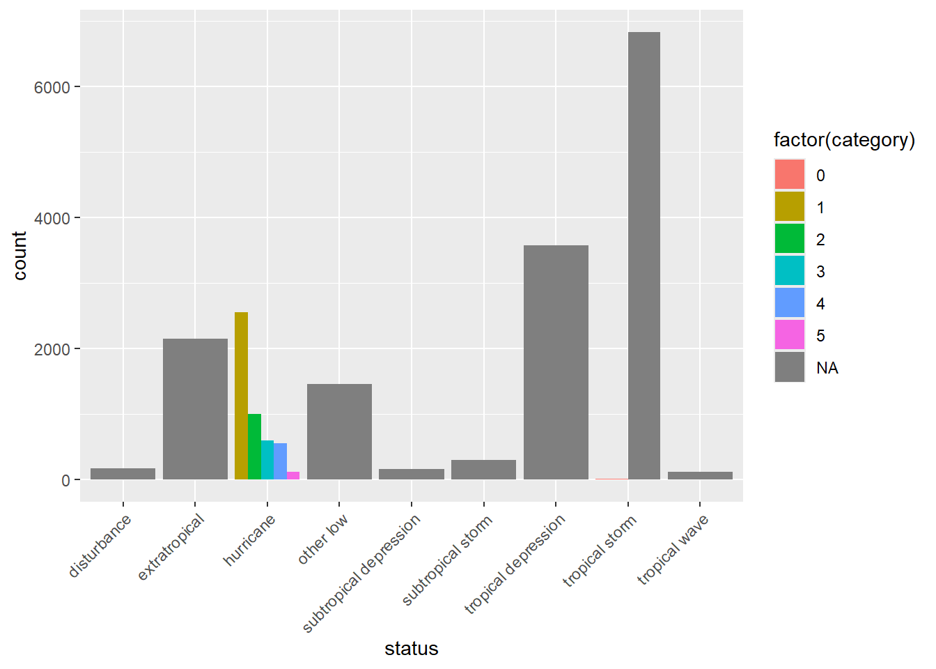
category variable in storms represents the Saffir-Simpson storm category (range from 1 to 5), which the scale based only on a hurricane’s maximum sustained wind speed.### Barplot
p1 = ggplot(storms, aes(x = status))+
geom_bar()+
scale_x_discrete(guide = guide_axis(angle = 45)) ### Rotate the x axis label
# Horizontal barplot
p2 = ggplot(storms, aes(y = status))+
geom_bar()
### Barplot of two variables
p3 = ggplot(storms, aes(x = status, fill = factor(category))) +
geom_bar(position = "dodge")+
scale_x_discrete(guide = guide_axis(angle = 45)) ### Rotate the x axis label
grid.arrange(p1, p2, p3, layout_matrix = rbind(c(1,2), c(3,3)))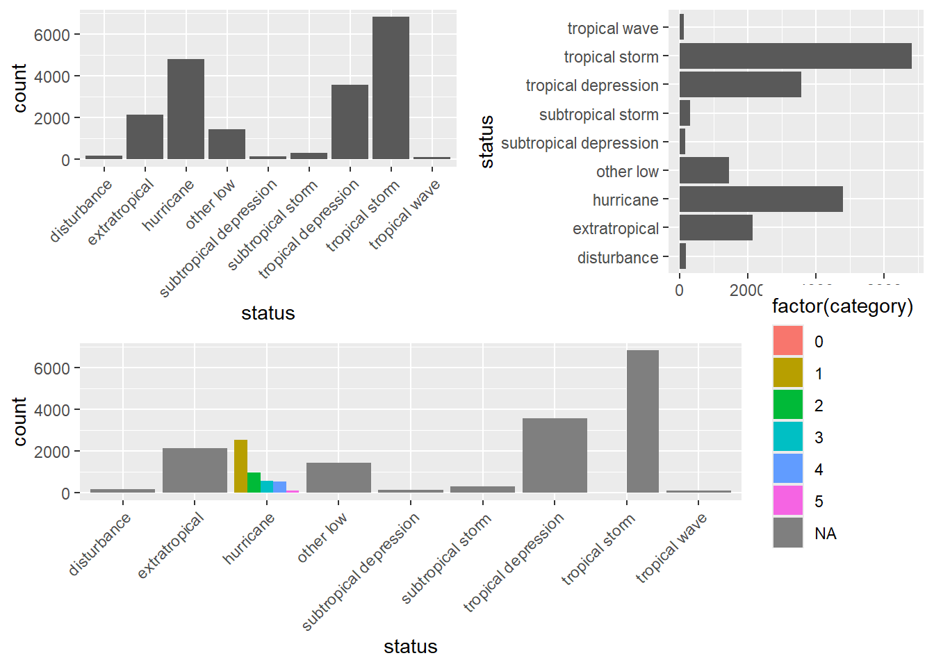
ggplot(storms, aes(x = status, fill = factor(category))) +
  geom_bar(position = "dodge")+
  scale_x_discrete(guide = guide_axis(angle = 45))

ggsave("The Barplots.png") ### Save the last plot
ggsave("p1.png", plot = p1) ### Save the plot specifiedR Graph Gallery https://r-graph-gallery.com/
Rstudio Cheatsheets https://www.rstudio.com/resources/cheatsheets/
Reference Books (Free online books with excellent material)
Comments
If a graph could be done with ggplot2, it could probably be done with base R graphics, and vice versa.
To take a quick look at the data, the one-line base R graphics functions are quick and easy.
For data visualization, ggplot2 is much easier to code and with a much better output.