library(tidyverse)
library(nycflights13)Lab 7 Data Manipulation and Visualization Practice
Load the packages
Question 1
We use the diamonds tibble from the ggplot2 package for this question. This tibble contains the prices and other attributes of almost 54,000 diamonds. There are 53940 rows and 10 columns. You may use ?diamonds to find more information about this data.
[5 pts] Use
mutate()to create a new variable,unitprice, that calculates the price per carat in the tibblediamonds.[10 pts] Which cut category (Fair, Good, Very Good, Premium, Ideal) exhibits the least or greatest variability in unit price? To explore this, create a boxplot comparing
unitpricevs quality of the cut. Additionally, usegroup_by()anddplyr::summarize()to calculate the standard deviation of unit price for each cut category. Provide comments on your findings.[5 pts] Which color category (D, E, F, G, H, I, J) has the most diamonds? Please use
count()to get the number of diamonds for each color category. In addition, answer this question by creating a barplot of variablecolor. Provide comments on your findings.[10 pts] Which combination of cut and color has the highest average unit price for diamonds larger than 1 carat? To answer this question, please filter the
diamondsdataset for diamonds larger than 1 cart, and select theunitprice,cut, andcolorcolumns. Usegroup_by()anddplyr::summarize()to calculateavgpricefor each cut and color combination. Then usearrange()to sort the results in descending order of average unit price. Provide comments on your findings.
Question 2
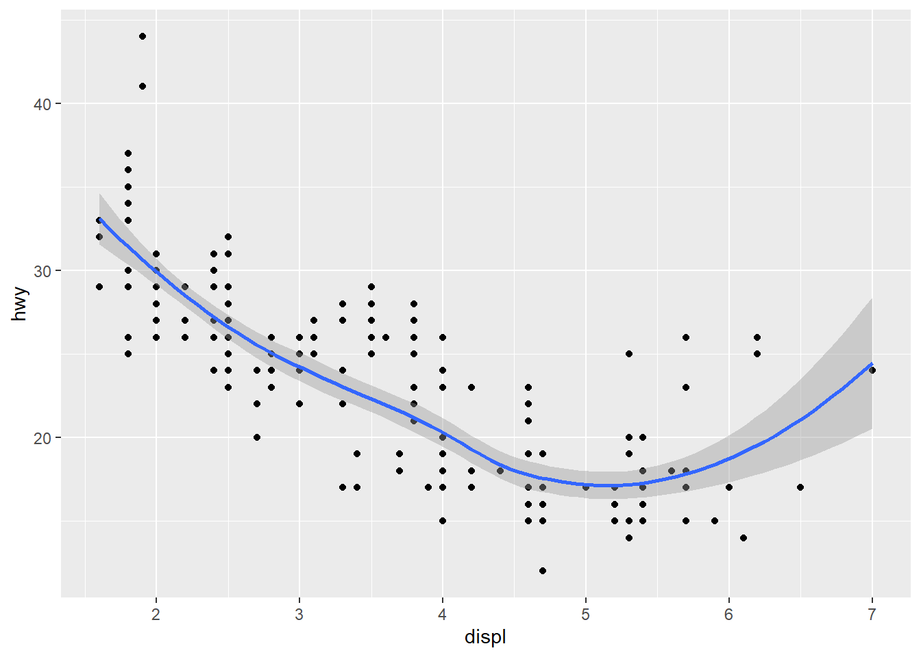
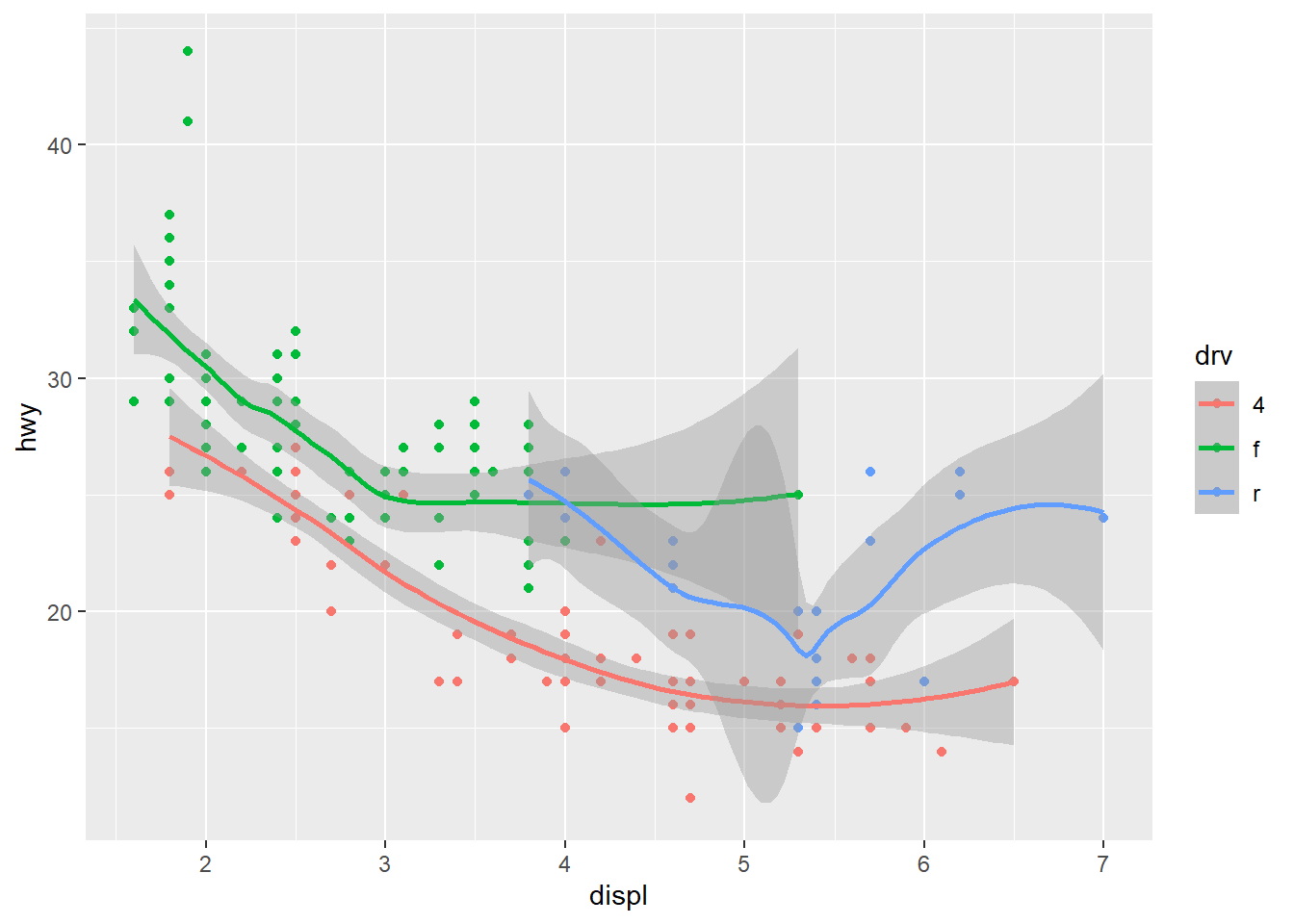
Re-create the R code necessary to generate the following graphs. The dataset is mpg from ggplot2 package.
- [10 pts] [Hint: You may use
geom_smooth(formula = y ~ x, method = "loess")to add the smoothed line(s) for the questions.]
- [10 pts]
[Hint: You may use color = drv.]
Question 3
[10 pts] Use
flightsdataset from the nycflights13 package. Find the average departure delay by month.[10 pts] Visualize the average departure delay by month from part (a) by drawing a bar-plot. Which three months have the worst average departure delays? [Hint: You may need to convert month to factor type using
as.factor().][10 pts] Currently, the
dep_timeandsched_dep_timeare convenient to look at, but hard to compute with because they’re not really continuous numbers. Please convert them to a more convenient representation of number of minutes since midnight. Denote the two new variables asdep_time_minutesandsched_dep_time_minutes, respectively.
For example, 1755 corresponds to 5:55 pm. We can convert 1755 to minutes as \(17*60 + 55 = 1075\) minutes from midnight. You may consider using integer division operator \(\%/\%\) and modulus operator \(\%\%\).